Option chain
Live Option Chain: Read OI, PCR and Max Pain in AOC
The live option chain in AOC is a real-time table of every strike for one symbol, with calls on one side, puts on the other and the spot price bar in between, colour-coded so the heaviest OI, OI change and volume jump out. F&O traders keep it open through the session to watch where writers are building positions and how support and resistance shift.
On this page
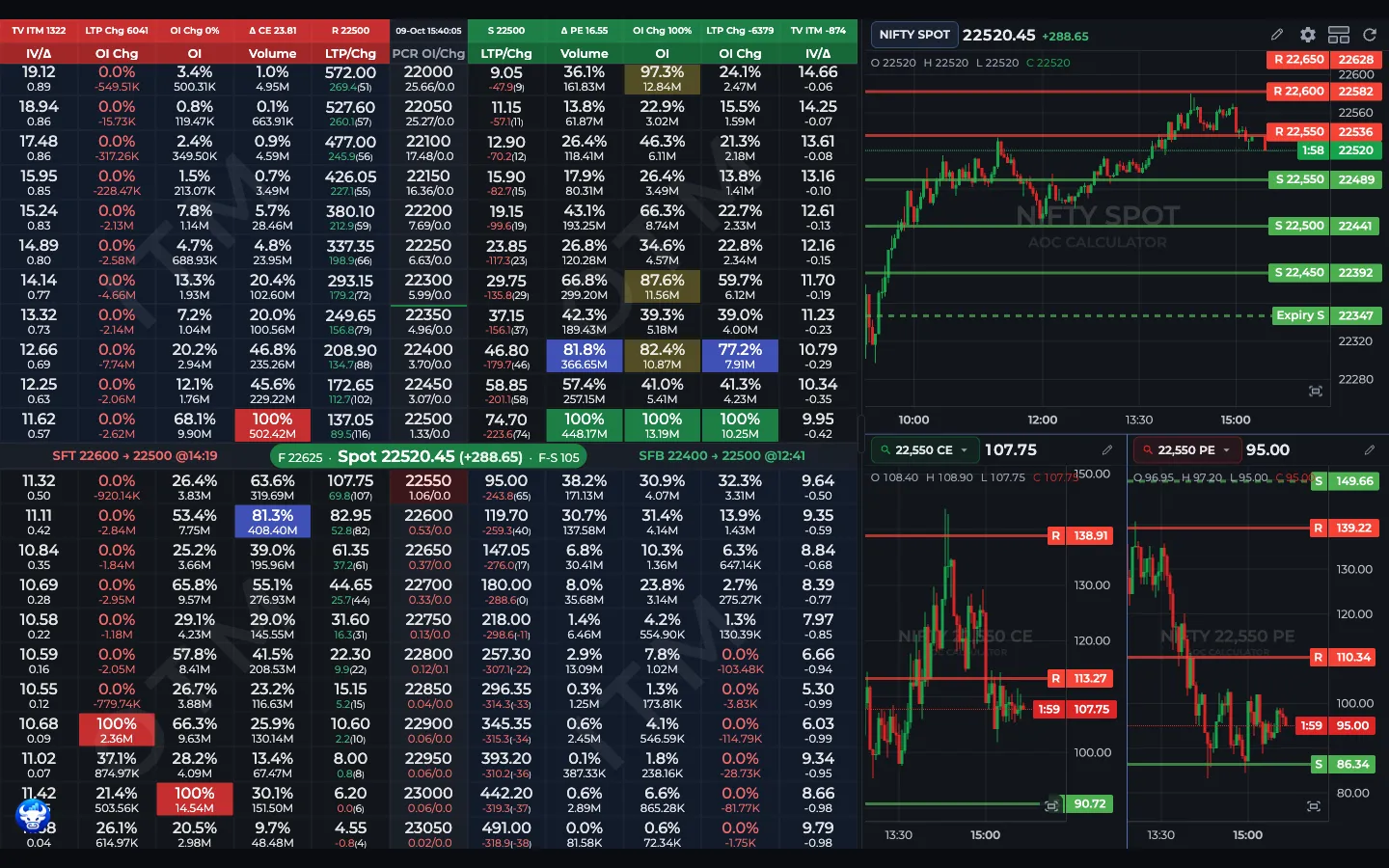
- 1Header row: TV ITM, LTP Chg, OI Chg, R and S
- 2Column labels: IV/Δ, OI Chg, OI, Volume, LTP/Chg
- 3Spot price bar with F-S gap
- 4SFT and SFB shift labels
- 5Split-screen live chart
Who can see the live chain?
The live chain needs a login and AOC Pro. On a free account the page shows the plans with the note "Live option chain is available with any AOC plan"; see pricing. Visitors who are not logged in get a log in prompt and a summary delayed by 15 minutes: spot, future, PCR, max pain, and the highest call and put OI strikes.
Once you are in, the chain updates by itself whenever a new snapshot is published. No refresh button needed. The browser tab title starts with the live spot price, so you can watch NIFTY from another tab.
What are the numbers in the top header row?
The first sticky row sums up the whole chain. Call side, from the left: TV ITM (time value of in-the-money calls), LTP Chg (total LTP change), OI Chg (the call share of fresh OI added today, in %), Δ CE and R, the resistance AOC computes from OI. The put side mirrors it: S (support), Δ PE, OI Chg, LTP Chg, TV ITM. The middle cell is the snapshot time in IST.
Every one of these is a button. TV ITM opens the ITM TV chart, LTP Chg opens the LTP change chart, OI Chg opens the daily OI data chart, Δ opens the Greeks graph, R and S open the Oi2Oi max OI chart, and the time cell opens Intraday S/R Shiftings.
What do the columns show?
The second row labels the columns. By default each side shows IV/Δ, OI Chg, OI, Volume and LTP/Chg, and the put side is mirrored so both read towards the strike. A sixth column, Rev LTP/Spot (reversal price), is off by default; turn it on in the column editor.
OI Chg, OI and Volume cells have two lines: the figure and its percentage of the biggest value in that column on that side. The heaviest strike therefore reads 100%. With Percentage first on (the default) the percentage is the top line. The LTP cell shows the price, then the day's change and, in brackets, the time value. The strike cell's second line is that strike's put/call OI ratio and OI change ratio; it turns red when the strike PCR is below 0.75.
What do the red, green and yellow cells mean?
In the OI Chg, OI and Volume columns the highest call value gets a red box and the highest put value a green box. The second highest on either side is yellow. Any cell at or above the Highlight threshold (75% of the column's top value by default) gets a faint yellow, unless you switch on Hide 3rd highest.
Example: NIFTY 22,500 CE shows OI 100% in red and 22,400 PE shows 100% in green. Writers are defending 22,500 above and 22,400 below. If 22,600 CE is yellow at 82%, resistance has a backup one strike higher.
A zero or negative figure is written in red text. In-the-money halves of each row are shaded, and a thin red or green line on a strike edge marks the expiry resistance and support.
How do I read the spot price bar and the SFT / SFB labels?
The spot bar sits between the two strikes that bracket the current price. It shows the spot with its change, the future price and F-S, the future minus spot gap. Its colour follows the overall PCR: green above 1.2, red below 0.8, blue in between. Tap it for Future Buildup. Switch Default pricing to Future in Settings and the bar, the divider position and the ITM shading follow the future instead.
On each side of the bar is a shift label for resistance (call side) and support (put side), for example "SFT 22600 → 22500 @11:42". SFT in red means the level moved down to a lower strike; SFB in green means it moved up. "No shift yet" means the level has not changed today. Tap a label for the full S/R shifting history.
What opens when I tap a cell?
Every pop-up carries an info icon that links to its guide.
- Call IV/Δ cell: Reversal Chart
- Put IV/Δ cell: Combined Price Chart
- OI Chg cell: OI Charts for that strike, with tabs OI Chng, VOI, Cross OI, PCR, OI, CE BuildUp, PE BuildUp, COI% and Volume
- OI cell: % Graph
- Volume cell: the strike's reversal level (resistance for a call, support for a put), or the Alice Blue order ticket when trading is on (see Trading Panel)
- LTP cell: LTP Calculator
- Strike cell: Support & Resistance for that strike
- Rev cell: copies the reversal price
What is below the chain?
Scroll past the last strike. The first strip shows the Expiry date with expiry S and R (tap either to copy it), then three buttons: GEX for the gamma exposure chart, the split screen toggle and Settings.
Next come TV CE and TV PE percentages (tap for the time value chart), LTP CE and LTP PE shares, the CE and PE time value of the three strikes either side of spot, and MAX PAIN with its distance from spot. See max pain if the term is new.
Three cards follow: CPR Volume, PCR OI and PCR OI Change with their CE and PE totals. Tap a ratio for its intraday chart. The Greeks table lists IV, Delta, Vega, Gamma (x1000) and Theta for calls, puts and the difference.
How do I use the split-screen chart?
- Split screen is on by default: the chain sits beside a live chart, or above it on a phone or tablet held upright.
- Drag the thin divider to give the chain or the chart more room.
- Use the chart's own buttons for candle or line, spot or future, intraday or expiry data and the candle interval.
- Tap the split screen button under the chain to hide the chart for this session, or turn Split screen off in Settings to start without it.
Frequently asked questions
How often does the AOC live option chain update?
It updates on its own each time a new snapshot is published during market hours, over a live connection, so you never need to refresh the page. The time in the middle of the header row shows when the snapshot on screen was taken.
Can I change the expiry on the live option chain?
Not on this screen. The live chain follows one expiry, shown in the strip below the last strike. For past sessions and other dates, use the Back Tester.
Why is the live option chain stuck on loading?
After a few seconds the loader offers a Server dropdown and, after a short countdown, a Clear Data & Cache button. Try another server first. Clearing data does not touch your plan, but it logs you out and resets your settings in this browser, so save them to your account beforehand.
What does 100% mean in an option chain cell?
The percentage line compares the cell with the largest value in the same column on the same side. 100% is the strike with the highest call OI (red box) or highest put OI (green box), and 82% means 82% of that top value.
What does the AI button next to the symbol do?
It switches the chain to the AI variant of the symbol, shown as NIFTY-AI in the title, with AOC's AI-based option chain data. Tap it again to go back to the regular chain.
Last updated