Strike tools
Percentage Graph: Volume, OI and OI Change % of a Strike
The Percentage Graph (% Graph) in AOC shows how one strike's volume, open interest and OI change compare with the highest strike on the same side, as percentages, through the day. A strike at 100% is the leader; one climbing from 40% to 90% is about to take over, and that is often how support or resistance shifts begin.
On this page
Where do I find the % Graph?
Tap the OI cell of a strike. The CE half opens the call graph, the PE half the put. The pop-up title reads, for example, % Graph · 22500 PE.
It works on the live chain (AOC Pro) and in the Back Tester. To watch several strikes side by side, use Multi Percentage Graphs instead.
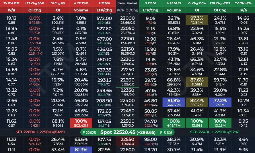
- 1CE OI cell opens the call graph
- 2PE OI cell opens the put graph
What do the percentages mean?
Each value is this strike's figure divided by the highest figure on that side of the chain. If the 22,400 PE has the most put OI, it is at 100% and the 22,500 PE with half as much reads 50%. The OI, Volume and OI Chg cells in the chain show the same percentages under the raw numbers.
OI change percentage is 0 when the strike's OI change is negative.
What do the lines and colours mean?
Tap a legend chip to hide a line. On the live chain new points are added as each chain update arrives, so the graph keeps growing while it is open.
- Volume (blue): volume %.
- OI (purple): open interest %.
- OIChng (orange): OI change %.
- Dashed grey line: your Highlight threshold from Settings (75% by default), the same level at which the chain highlights cells in yellow.
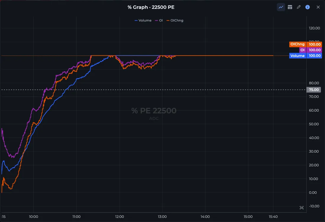
- 1Chart / Table switch
- 2Legend: Volume, OI, OIChng
How do I use the Chart / Table switch?
The two icons in the pop-up title bar switch between Chart and Table. The table lists Time, Volume, OI and OIChng, newest first, with a ▲ or ▼ and the change from the previous row in brackets.
In table mode the title bar also shows an interval picker (30s, 1m, 2m, 3m, 5m, 15m; 3m by default) and a number format toggle.
Worked example: spotting a new support
- NIFTY's support is 22,400, where PE OI is highest. You open the % Graph for the 22,500 PE.
- At 10:00 the OI line reads 46% and OIChng 52%.
- By 12:30 OI is 81% and OIChng has hit 100%: the 22,500 PE is now adding more fresh OI than any other put.
- When OI also crosses 100%, the chain's support will shift up to 22,500. You saw it coming two hours early, and you can confirm the shift in the S/R shifting list.
Frequently asked questions
What is the percentage graph in the option chain?
It plots a strike's volume, OI and OI change as a percentage of the highest strike on the same side, through the day. The strike with the most OI reads 100%.
What is the dashed line on the % Graph?
It is the Highlight threshold from Settings, 75% unless you changed it. Values above it are the ones the option chain highlights in yellow.
How do I see the percentage values in a table?
Tap the table icon in the pop-up title bar. You get time-stamped Volume, OI and OIChng values with the change from the previous row, and you can sample them every 30 seconds up to every 15 minutes.
Last updated