Charts and strategies
Multi Charts: Up to 8 Live Synced Charts in One Screen
Multi Charts is the AOC screen that puts up to eight live charts side by side, each one showing a spot index or stock, its future, or a single CE or PE strike. So NIFTY, BANKNIFTY and the two strikes you are trading can sit on one screen, with the crosshair moving across every chart together.
On this page
Where do I find Multi Charts and who can use it?
Open Charts from the side menu, or go straight to /multi-charts. You need to be logged in.
Multi Charts is part of every paid AOC plan. On the free tier the page shows the plans instead of the charts. See pricing for what each plan includes.
How many charts can I show, and which layouts are there?
Up to eight. The Layout button (grid icon in the app bar) opens Select Chart Layout, with 44 layouts grouped by chart count: one layout for 1 chart, two for 2, six for 3, ten each for 4 and 5, seven for 6, and four each for 7 and 8. You get the obvious ones (2x2 Grid, 3 Columns, 4 Rows) and lopsided ones like 1 Left, 3 Right or 2 Top, 3 Bottom.
The first time you open the page you get the 2x2 Grid, filled with your favourite symbols first and then the usual ticker order.
Drag the thin divider between two charts to resize them. Double-click a divider to put it back. Your layout, sizes and every chart's settings are saved in this browser, so the screen comes back the way you left it. Reset Layout (the circular arrow) goes back to the 2x2 Grid with the default symbols, and Refresh Charts reloads the data.
How do I set up a chart?
The header also shows the live price and the day's change in brackets when there is room.
- Click the symbol button at the top left of a chart (it shows the scrip, for example NIFTY or BANKNIFTY 52000 PE).
- Search a stock or index and pick it from the list.
- Choose Spot, Future, CE Call or PE Put. For an option, the strike list opens centred on ATM.
- For Spot or Future, press Show Spot or Show Future. For an option, tap the strike you want: the chart switches straight away.
- Use the strike dropdown in the chart header later if you want to move to another strike without reopening the picker.
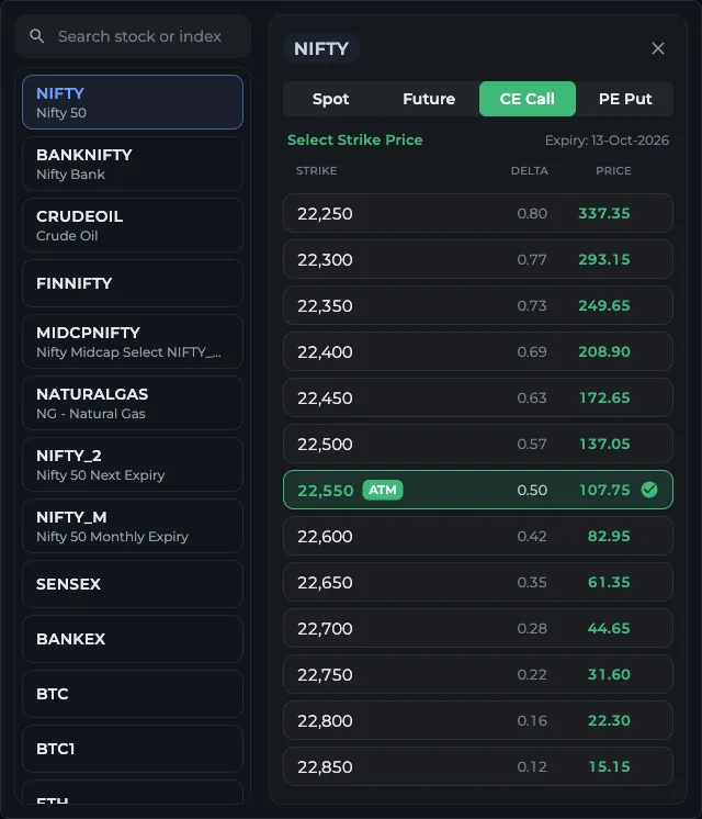
- 1Search a stock or index
- 2Pick the symbol
- 3Spot, Future, CE Call or PE Put
- 4Tap a strike, the list opens at ATM
What do the buttons in each chart header do?
Each compared asset shows as a chip under the header. Tap the chip to edit it, or its cross to remove it.
- Pencil: the drawing tools for that chart.
- Add Asset / Compare (plus icon): put a second instrument on the same chart. Pick Separate to draw it as its own line on a left-hand scale, or Add (A + B) and Subtract (A - B) to merge it into the main series. A merged chart of NIFTY 25,000 CE plus 25,000 PE is a quick live straddle chart.
- Gear: chart settings. Switch Candle or Live (line), Intraday or whole Expiry, the candle Interval (1, 3, 5 or 15 minutes, default 3), rising and falling candle Colors, S/R average or S/R current, and Reset for that chart.
- Link icon: opens that symbol's option chain in a new tab.
- Maximize Chart: fills the page with one chart. Press it again (Restore Grid) to go back.
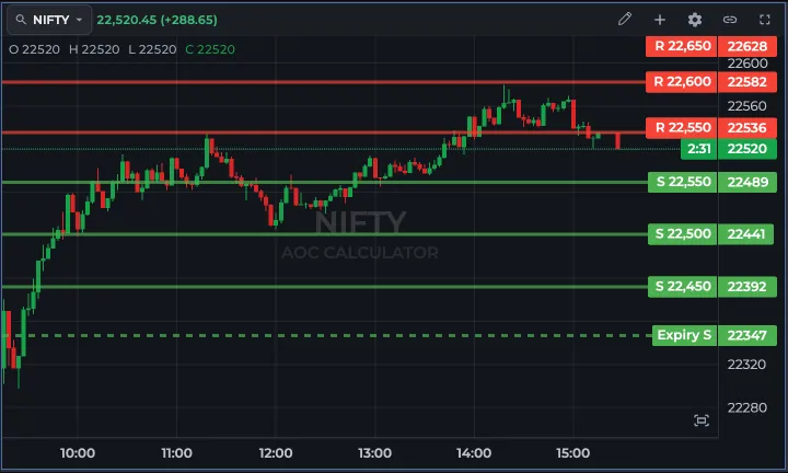
- 1Symbol button: change instrument
- 2Pencil: drawing tools
- 3Add Asset / Compare
- 4Gear: chart settings
- 5Maximize Chart fills the page
What are the coloured horizontal lines on the chart?
They are support and resistance levels taken from the live option chain, the same levels you see in strike support and resistance. On a spot or future chart they sit at index levels. On a CE or PE chart, AOC converts the spot levels into the option's price using its delta, gamma and theta, so the line shows roughly where the premium would trade when spot reaches that level.
The gear menu chooses whether the levels use the average or the current S/R. The lines are hidden while a compared asset is on the chart, because two price scales would make them misleading.
On a live candle chart you also get a countdown to the current candle's close next to the last price. In Expiry mode a dashed blue line marks where each trading day starts.
Are the charts synced?
The crosshair is. Hover over 10:45 on the NIFTY chart and every other chart shows its own 10:45 candle with the OHLC values at the top left. Zoom and scroll stay per chart, and the small fit button at the bottom right of each chart snaps it back to show all the data.
Charts update from the live feed during market hours, one feed per symbol, so eight charts of NIFTY strikes do not cost eight feeds.
Frequently asked questions
How many charts can I open at once in AOC Multi Charts?
Up to eight, in any of the 44 layouts in Select Chart Layout. Each chart can show a different symbol and instrument: spot, future, or one CE or PE strike.
Can I chart a straddle or a spread in Multi Charts?
Yes. Set the chart to one leg, then use Add Asset / Compare with Add (A + B) to merge the second leg into the same series, or Subtract (A - B) for a spread. You can add more than one asset to a chart.
Is Multi Charts free?
No. Multi Charts needs an active paid AOC plan. Free users see the plans on the page instead. Check the pricing page for current plans.
Will my layout be there next time?
Yes, in the same browser. The layout, the divider sizes and each chart's symbol and settings are saved locally. A different browser or device starts from the default 2x2 Grid.
Last updated